
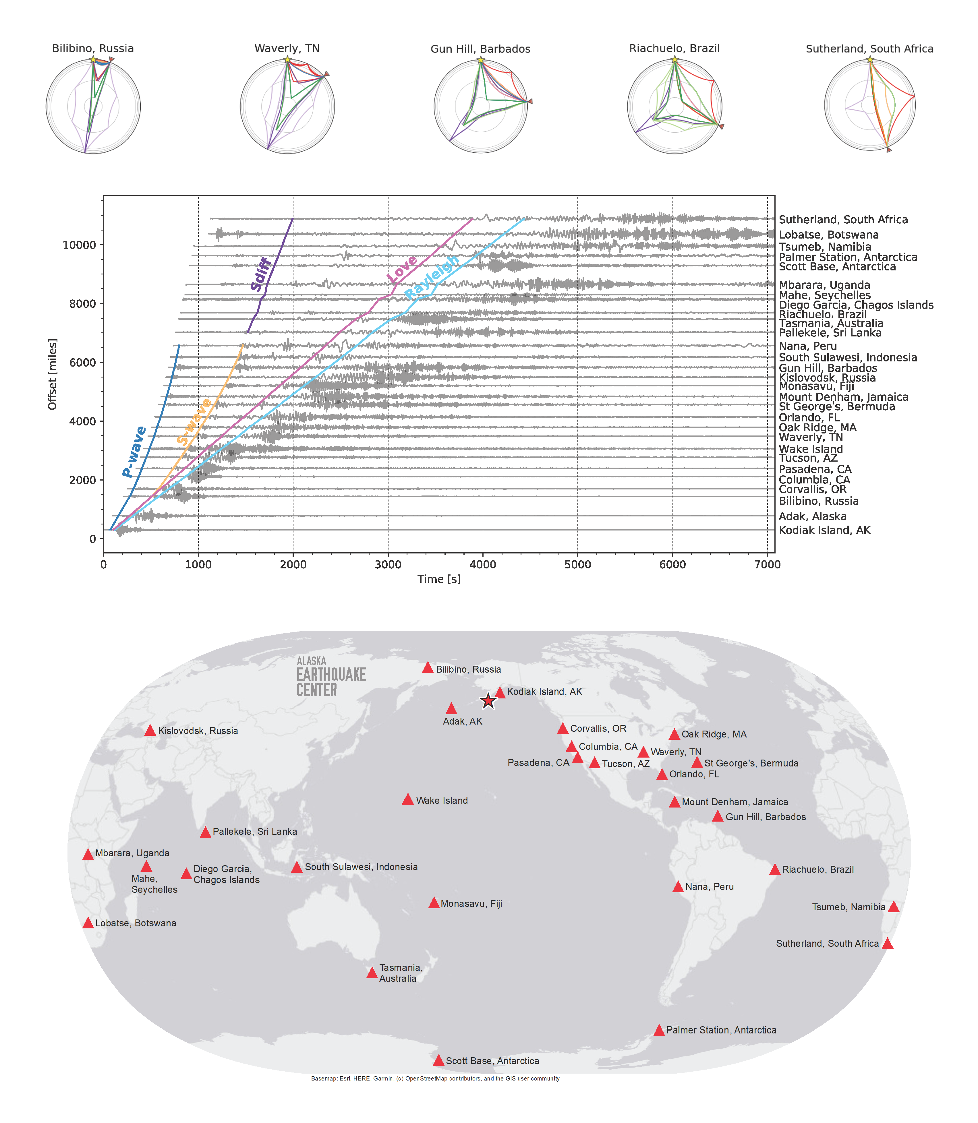


Large earthquakes, like the recent M7.8 in Alaska, can be seen at seismometers around the world! When an earthquake occurs, seismic energy travels in all directions, much like ripples in a pond. The globes at the top illustrate this (yellow star = the earthquake, red triangle = seismic station). The colored lines represent different paths seismic energy takes through the earth, and how the energy interacts with the earth’s layers (represented by gray circles). From this, it’s easy to see how earthquakes provide the best tools for understanding the earth’s internal structure!
The middle graphic shows recordings of these seismic waves from stations around the earth. The y-axis shows the distance from the earthquake epicenter and the x-axis shows the time in seconds. The colored lines show some of the most recognizable seismic phases, from left to right: P, S, Sdiff, Love, and Rayleigh waves. Colors for P, S, and Sdiff waves match the same paths in the globes at the top (Love and Rayleigh travel along the surface of the earth, so aren’t shown on the globes). Sdiff waves are created at a distance where the seismic energy travels deeply enough that there is no longer a direct S wave - the energy travels along the boundary between the outer core and mantle. (In the seismogram, the Sdiff “continues” when the S wave disappears). At increasing distances, the seismic signal is dominated by the Love and Rayleigh waves. The map shows the locations of seismic stations (red triangles) that recorded the waveforms in the chart, in relation to the M7.8 mainshock (red star).