


As we approach the one-year anniversary of the M7.1 Anchorage Earthquake on November 30, 2018, we reflect on the scientific and societal impacts of the earthquake. Data has continued pouring in over the past year and researchers will continue to examine this earthquake for years to come. Let’s take a look at some of what we’ve learned during the last year.
Alaska sits on top of a region where two major tectonic plates interact: the Pacific Plate sliding under, or subducting, the North American Plate. The Anchorage Earthquake occurred in the northeastern section of the downgoing portion of the subducting Pacific Plate (see video).
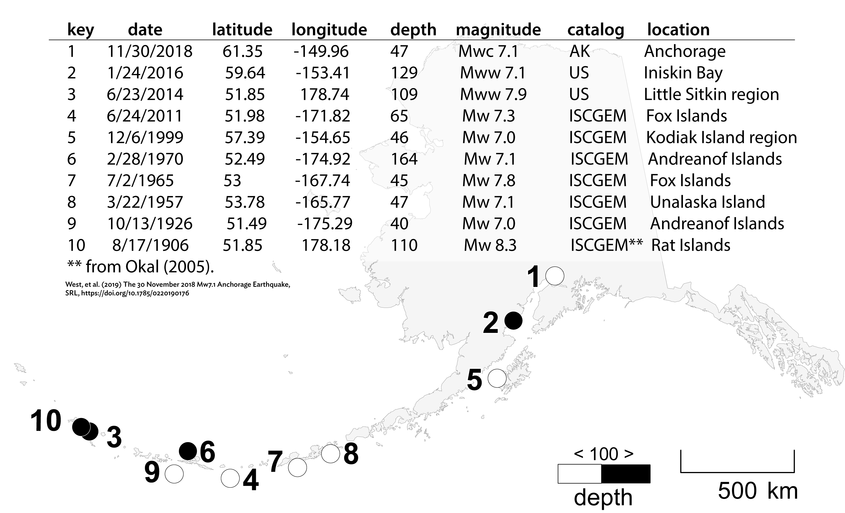
While the largest earthquake potential is at the interface between the subducting plate (or slab) and the North American Plate, as was the case in the 1964 M9.2 Great Alaska Earthquake, we routinely record earthquakes within the downgoing slab down to depths of 150 miles. We call these intraplate earthquakes. They are caused by the pulling and squeezing of the plate as it is forced deep into the Earth. Alaska has a long history of these large-magnitude intraplate earthquakes (See figure 1). They are also common in subduction zones around the world, including Japan, Indonesia and Mexico.
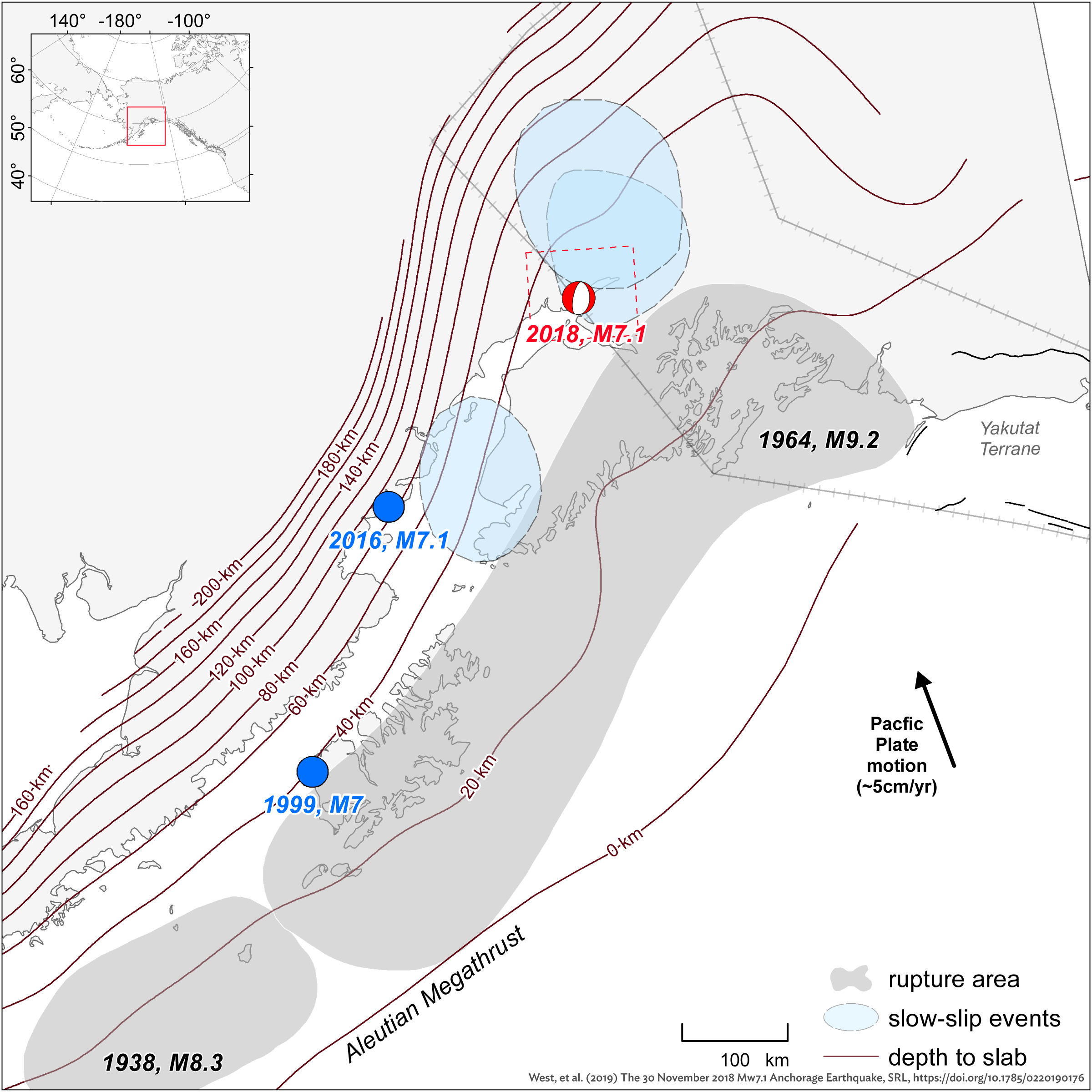
The region surrounding the mainshock is complex. Figure 2 shows some of the regional details. The subducting slab starts dipping at a shallow angle, then quickly changes to more steeply dipping. The red lines in figure 2 mark the depth to the top of the slab. The video shows this in cross section. This earthquake was deeper and further north than the Great Alaska Earthquake. It was northeast of the 2016 M7.1 Iniskin and 1999 M7.0 Kodiak Island earthquakes, both of which are similar intraplate events. The light blue shapes are regions where researchers have identified historical “slow-slip” events. Slow-slip events can be thought of as earthquakes where the rupture took place over months as opposed to seconds. These are only noticed by sensitive equipment.
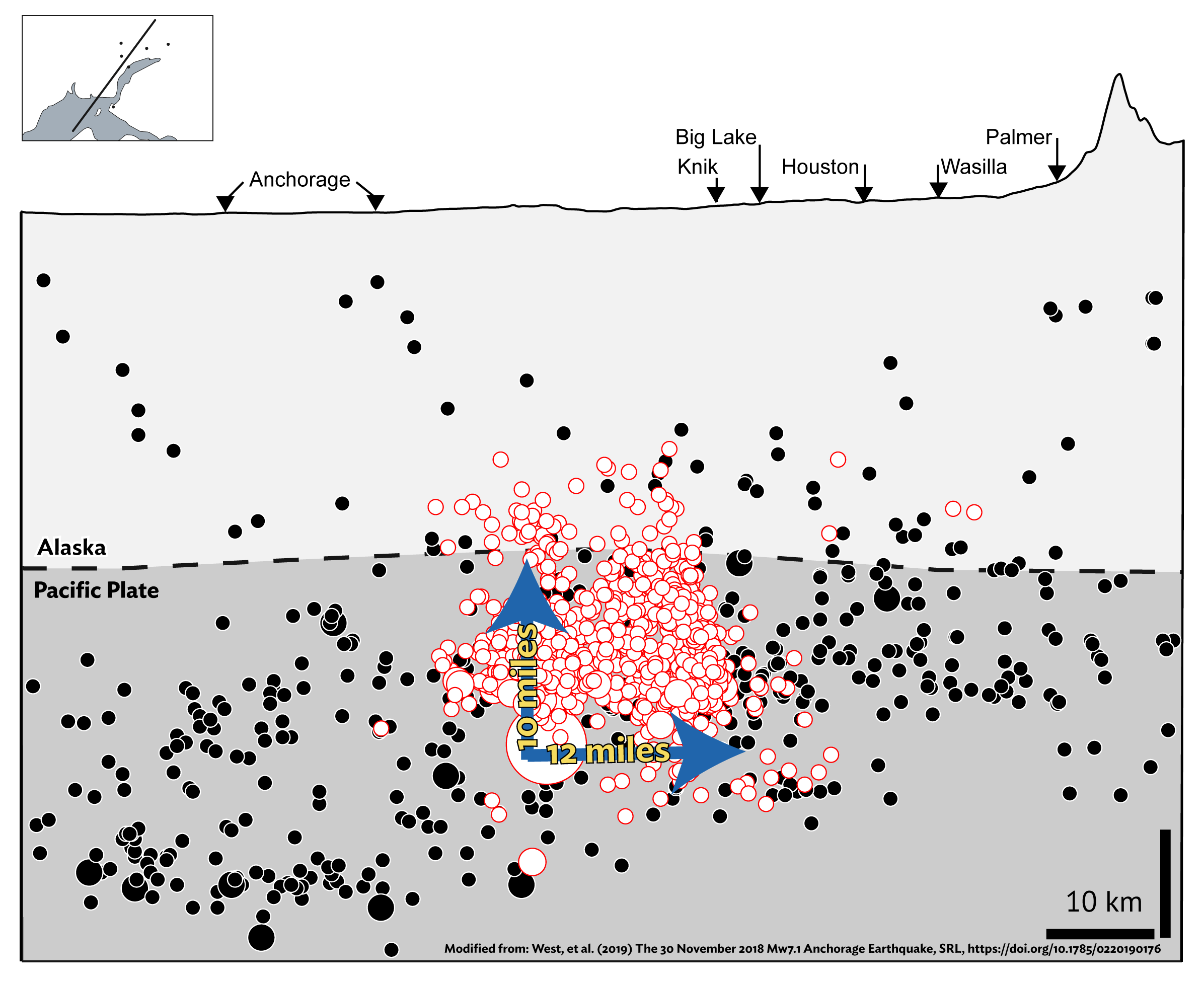
The mainshock was a normal faulting event, in which the fault dips at an angle and the top segment slips down relative to the bottom segment. These types of earthquakes typically occur in regions that are being pulled or bent, such as where the Pacific Plate is being pulled down by gravity as it subducts beneath Alaska (see video). The earthquake rupture started 35 miles deep and 7 miles north of downtown Anchorage. The rupture then continued to break 10 miles upward and 12 miles northward, but remained well below the surface and within the slab (see figure 3). In a map view, this earthquake appears to have occurred 5-10 miles north of Anchorage. But viewed in cross section with depth and rupture size considered, the earthquake actually occurred deep beneath Anchorage and the Mat-Su Valley, and at roughly the same distance from each.
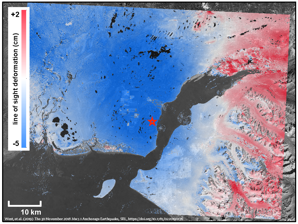
Earthquakes change the shape of the Earth. Because the Anchorage Earthquake occurred 30 or so miles underground, it isn’t possible to visually inspect the amount of movement on the fault. However, the earthquake did leave a permanent mark on the surface. The Pacific Plate stretched during the earthquake, making it slightly thinner. When this happened, the region directly above sank. Figure 4 shows the changes in elevation. Blue areas sunk up to a couple of inches, while red areas uplifted a fraction of an inch. These changes are too small to be perceived by people, but they are real and can be tracked with high-precision GPS, or in the case of figure 4, satellite-based techniques. The analysis in figure 4 is based on data from the SARVIEWS project. Learn more about SARVIEWS and the data from this earthquake on their website.
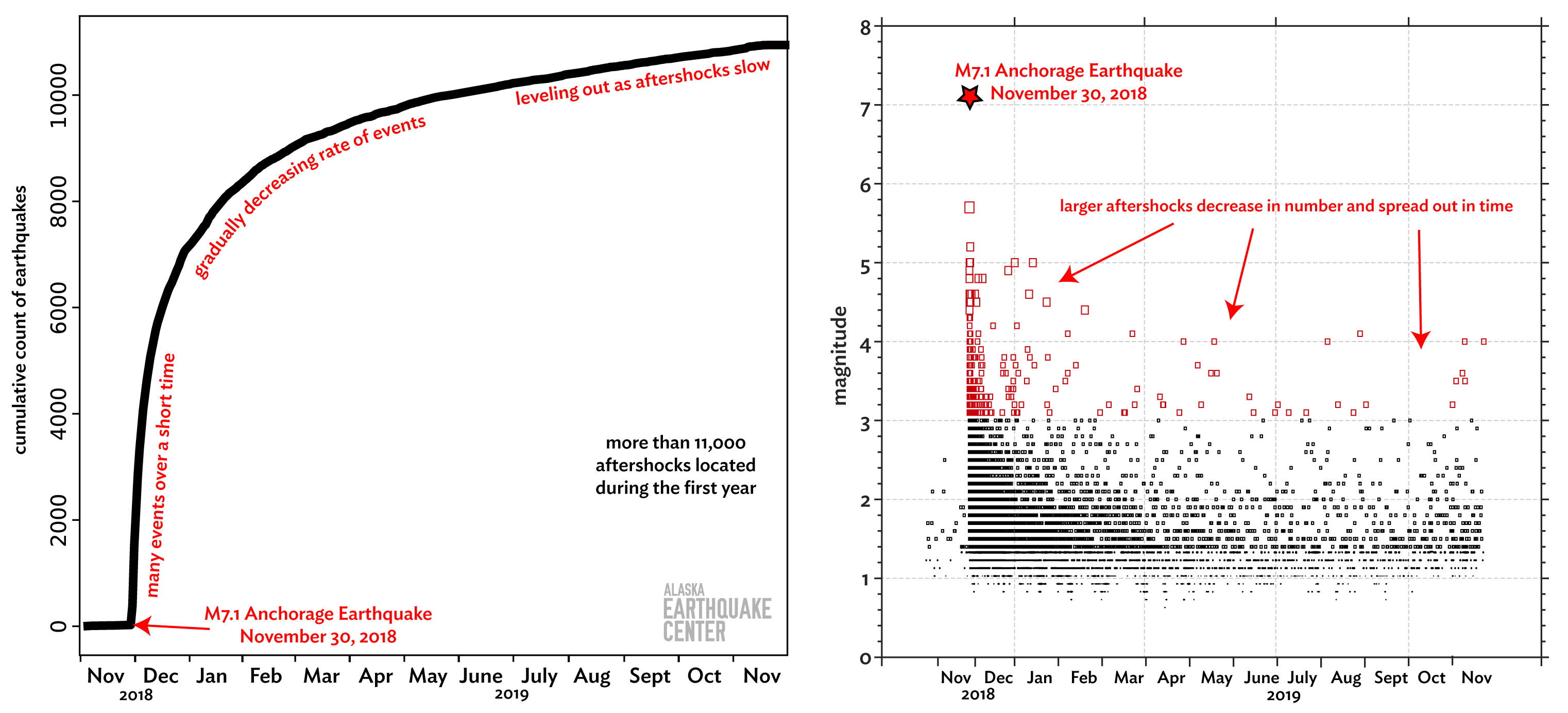
More than 11,000 aftershocks have been cataloged, with thousands more that are too small to locate. The Earthquake Center has determined a magnitude of completeness for the catalog of M1.3. This means we are confident we’re locating all aftershocks larger than or equal to 1.3. The largest aftershock was a magnitude 5.7 and occurred six minutes after the mainshock. The earthquakes have decreased in magnitude and become more spread out in time over the last year (see figure 5). More than 300 aftershocks have been reported felt. We expect aftershock activity to continue for another year and a half, but with fewer and fewer likely to be felt.
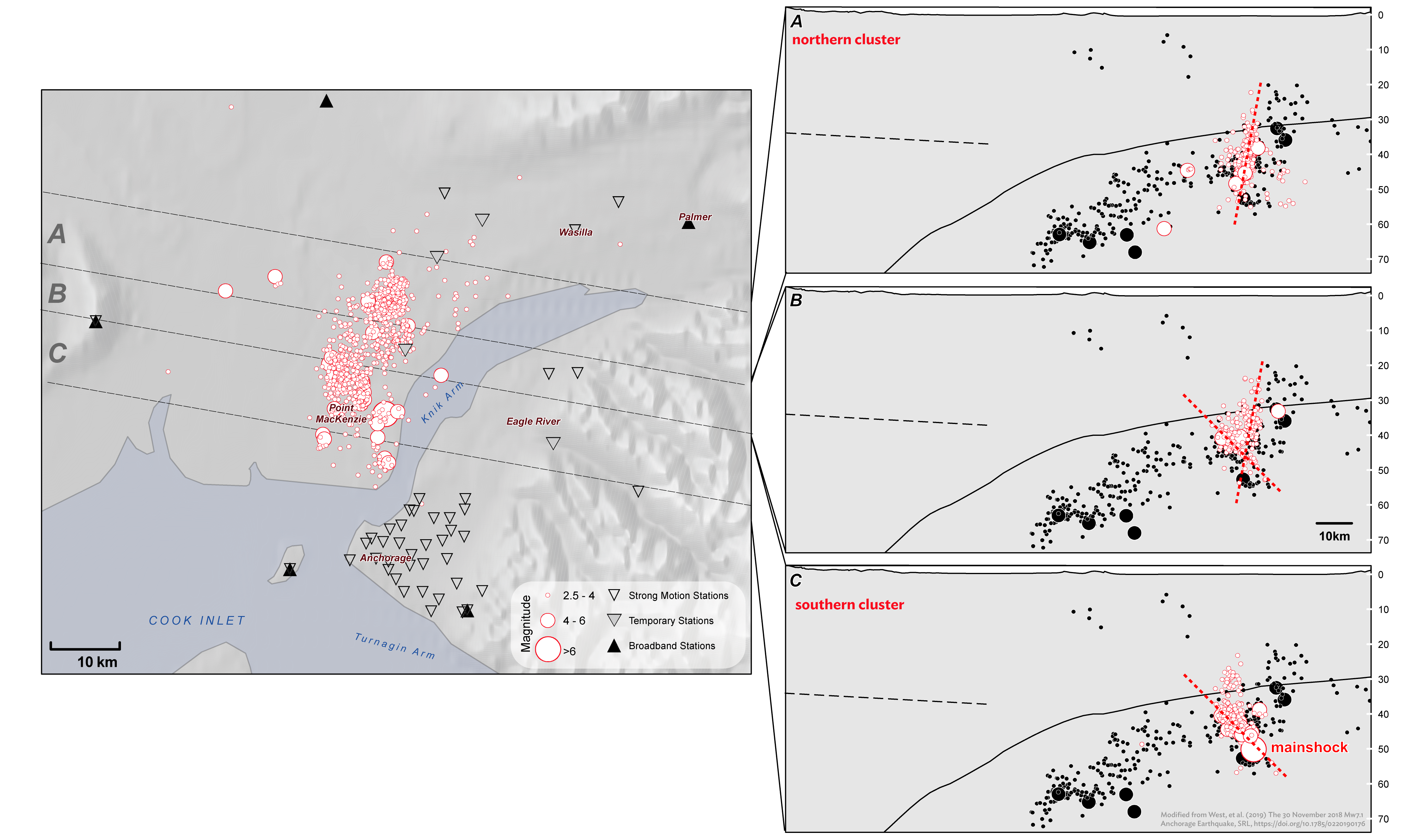
The aftershocks form two distinct clusters. The northern cluster is slightly offset to the east of the southern cluster (see figure 6 map). Looking at the aftershocks in cross section (see figure 6, right), the aftershock patterns dip at different angles (the red dashed lines in the cross sections). These aftershock patterns can tell us many different things about the mainshock rupture. One is that this earthquake rupture is very complex in nature, yet consistent with what seismologists have come to expect in the region. Another is that there is still more investigating to be done.
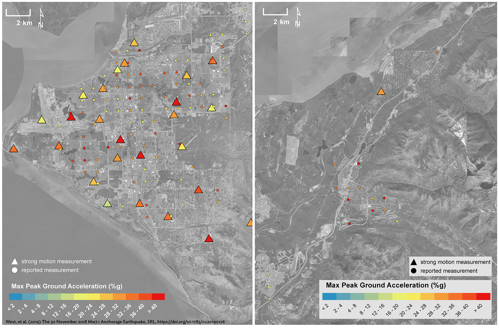
Ground motions are the measurements seismologists use to describe the intensity of shaking during an earthquake. They correlate with the size of the ruptured fault and how far it moved during the earthquake. The ground motions were large enough during this earthquake to exceed (or clip) the measuring ability of the broadband instruments close to the epicenter (see “Not all ground-motion sensors are created equal” for more information about clipping). The Anchorage Bowl, however, also has a dense network of strong motion instruments that recorded the shaking. Areas outside of the Anchorage Bowl, including Eagle River, had more sparse station coverage. Responses submitted to the USGS “Did You Feel It?” form allow us to fill in gaps where we do not have sensors to better assess where the strongest shaking was felt. Figure 7 shows the comparison between sensor coverage and the aggregated “Did You Feel It?” responses in Anchorage (left) and Eagle River (right). For places like Eagle River where the center has very few stations, the reports indicated that the community was hit particularly hard and can provide critical data points to authorities for emergency response.
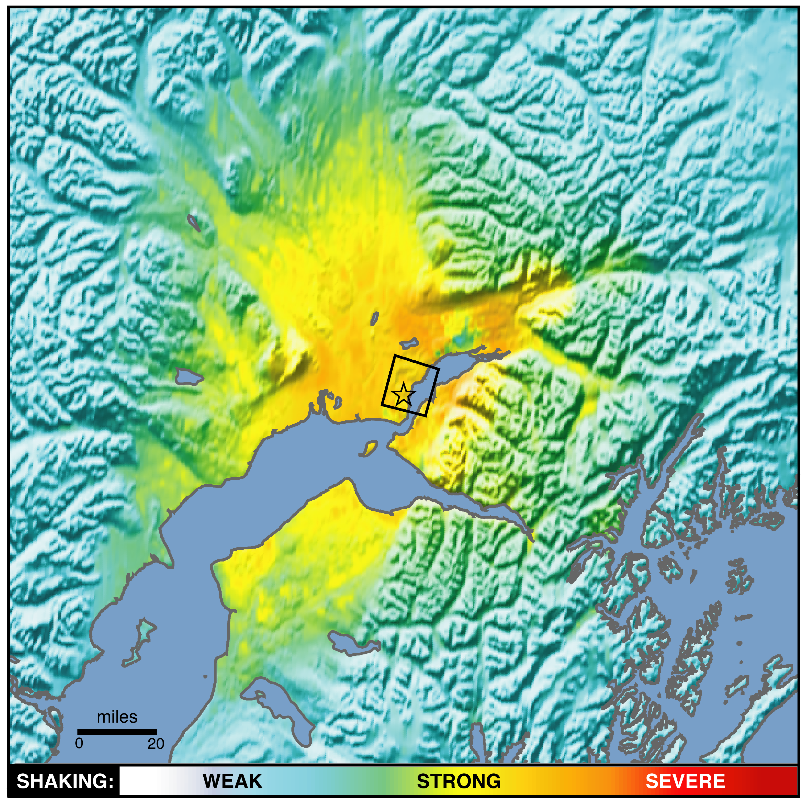
ShakeMaps are a visual representation of shaking across a region, color coded by intensity. Initially a ShakeMap is generated based on earthquake location, depth, and magnitude, along with any measurements from sensors located near the epicenter. For significant earthquakes the instrument intensities are combined with the collective “Did You Feel It?” responses, and a clearer picture of the shaking appears. This data, along with models of the fault parameters, are included in the calculations for the refined ShakeMap for the earthquake (figure 8). These ShakeMaps are used for a wide range of purposes, including damage estimation by local, state, and federal agencies; building inspection prioritization; and critical infrastructure monitoring.
The societal impacts of this earthquake were significant, the ramifications of which many people and agencies will be managing for years to come. It is widely acknowledged that structures built following the adoption of building codes fared better during this earthquake, but there is still room for improvement, including wider enforcement of the building codes and retrofitting of older buildings. More research is needed to identify the factors that contributed to the higher rates of damage to structures outside the Anchorage Bowl, including the influence of soils. There is much we will continue to learn from this earthquake to help us better inform Alaska communities.
Many of the figures and analysis presented in this piece were first published in the following professional papers.
West, et al. (2019) The 30 November 2018 Mw7.1 Anchorage Earthquake, SRL, https://doi.org/10.1785/0220190176
Ruppert, N., Et al. (2019) Aftershock Analysis of the 2018 Mw7.1 Anchorage, Alaska, Earthquake: Relocations and Regional Moment Tensors, SRL, https://doi.org/10.1785/0220190199