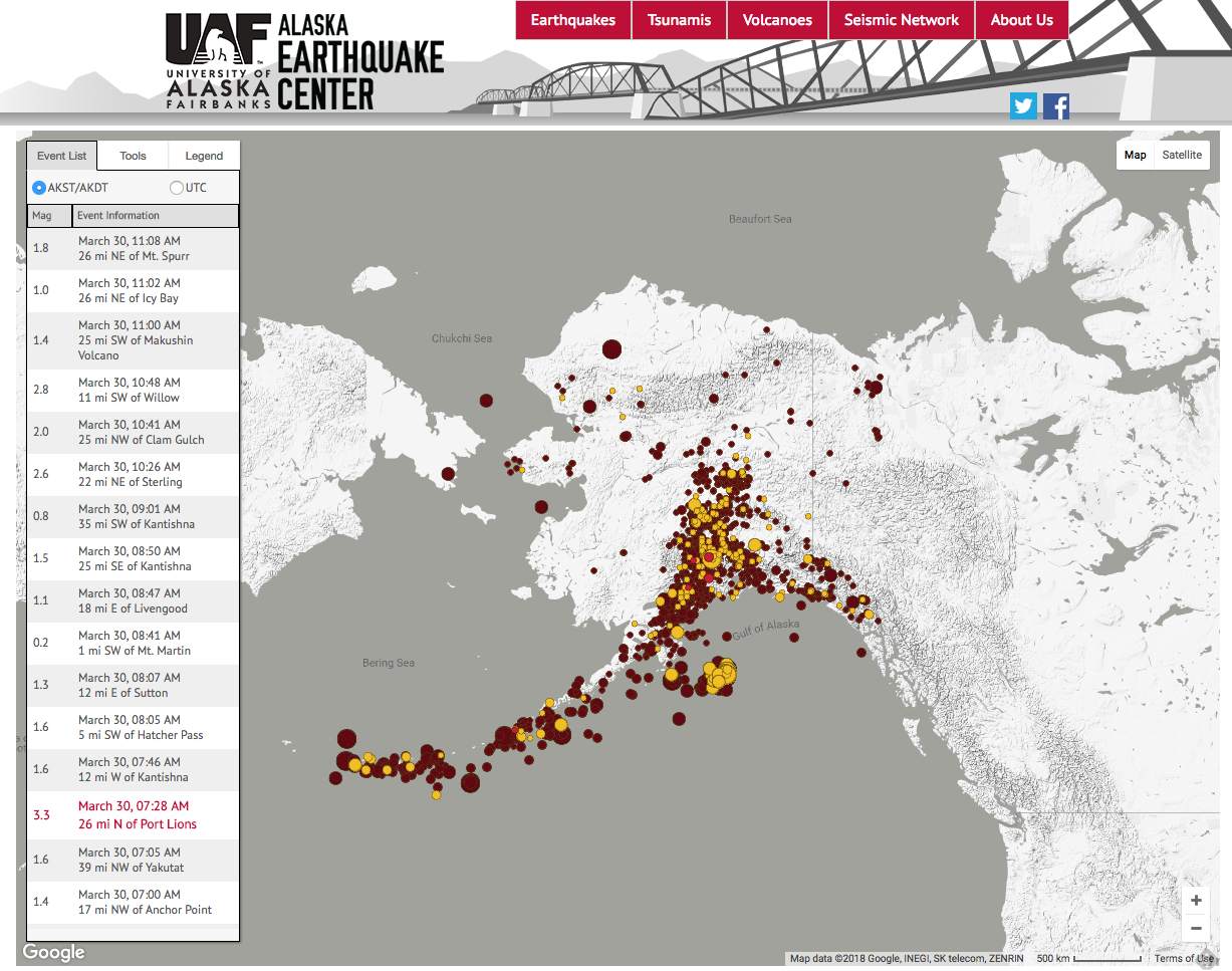
You may have noticed that we've launched an updated version of our recent events page.
The goals of the revamp were twofold:
- To make the map more usable for our users on non-desktop devices
- To bring a unifed look and feel to our products
Most of the Earthquake Center's website has been mobile-friendly from the beginning, with the notable exception of the recent events map. We have long wanted to rectify this shortcoming. With this update, the map should now scale much better to the resolution of your device and be easier to use regardless of how you access our site.
Functionally, nothing has changed. You can still view the last two weeks of earthquakes in the "Event List" panel. The "Data Laters" and "Analyze" links still allow you to add information to the map, such as current seismic stations and mapped faults, and to analyze recent earthquake activity in whatever part of Alaska you are interested in.
If you have never played with any of these tools, we encourage you to view a short tutorial video put together by our staff on YouTube at https://youtu.be/OVwF1zcMTGk.
The most obvious change, of course, is the new color scheme. We've switched from a blue/green to a grayscale basemap. The old yellow/orange/red earthquake colors have given way to maroon/mustard/red as part of our effort to create a distinct look and feel for all Earthquake Center products that highlight and bring focus to the data instead of the basemap.
Many thanks to our web development team, especially Lucas Cheek, for the many hours spent pouring over the code to get this major update to work just right.


